by Elizabeth S. Craig, @elizabethscraig My editor emailed me a week ago and said she was going to fit in a cover conference before the staff at Penguin left for Christmas break.
This was a little earlier than I expected for a book that’s coming out in 2014…but I’d much rather do it earlier than later, and I always appreciate this editor’s organization.
I quickly put together some ideas for her to present at the conference and emailed them to her. She and I discussed the ideas during a phone call.
At the end of the call, she said, “Great! Now, Elizabeth, if you get any great visions for the cover, just call me back anytime.”
I said dryly, “If I get any great visions for the cover, we’ll know I’ve had a small stroke.” I’ve mentioned to her before how difficult it is for me to come up with these kinds of ideas, since I’m not a visual thinker—although I’ve gotten better over the years.
For this Penguin (or, I guess, Penguin-Random House) editor, I submit ideas for cover elements—descriptions of rooms or outdoor spaces where major scenes take place, descriptions (and sometimes images, if I have them) of quilts that I’ve mentioned in the books, and how the murders were committed–they like having the knife or the gun, etc., somewhere on the cover.
My editor also likes the manuscript so that she can skim it for ideas for the conference. I’ve gotten better about sending an unfinished manuscript to her. This time was very early though: I submitted her a book with no ending and no chapter breaks…my deadline is in February, so the book isn’t finished yet. I managed not to freak out too much over this. Although I did warn her that I write description in last, so the manuscript might be of limited use to her.
For my other Penguin series, I really have no input in the cover (at least, I haven’t in the past). In many ways, this is a relief to me. :)
For my self-published books, I’ve given the cover designer the book description to give her an idea what we’re talking about, thoughts on a setting for the cover, and the murder weapons. Usually, for cozy mysteries, you have an idyllic scene with an element of danger interrupting the tranquility.
So, some general things to think about if you’re helping to contribute ideas to a designer or editor for a cover design (for either traditional publishing or self-publishing):
Think about what will appeal to your genre’s readers.
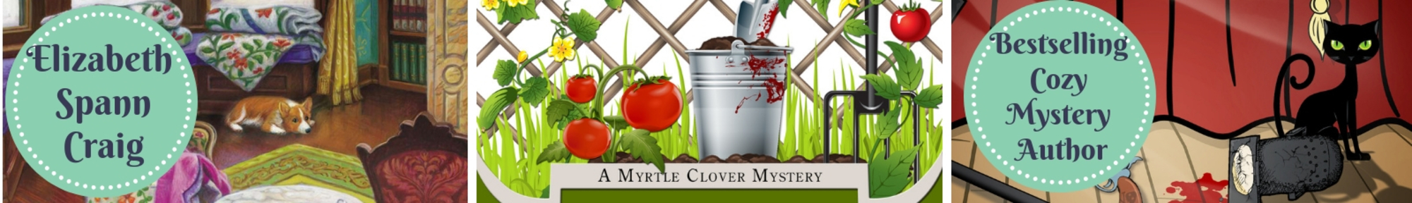
Make sure your cover indicates the genre. For me, that’s the element of danger that my editor asks me to indicate—the tea cup on its side, the ominous knife in the foreground…that sort of thing.
Remember to brand the covers in a series. I have several different series and they each have their own look. It helps readers identify the other books in the series.
Don’t be too stuck on having the cover accurately represent what’s transpiring in the book. This is something I’ve managed to relax more over. It used to seem very odd to me that Beale Street is depicted the way it is on the Delicious and Suspicious cover, for instance. But what the cover is meant to do is entice readers and act as a marketing tool. It doesn’t have to replicate a scene from the book. This third quilting mystery will have the series’ corgi on the cover—because it brands the series and readers love the dog (I’m a corgi owner, myself.) But the corgi isn’t present during the third book…merely mentioned.
How involved have you been with cover creation? If you self-pub, do you hire a designer and just give a book summary to the designer? If you’re traditionally published, how involved are you with the cover?
Elizabeth – Thanks for the good ideas for what to think about with covers. Readers really do notice them I think, and use them when they’re making purchasing decisions. So I agree they need to be planned carefully. I hadn’t thought about the series-branding, but that makes sense. I’d also say that there has to be something eye-catching about it. The cover doesn’t have to be lurid, but it has to draw the reader’s eye.
Interesting! I’m thinking self pubbing in the new year – and I’m very thankful I have a crit buddy who is also a wonderful cover designer :)
Since I’ve only self pubbed my memoir, I was totally involved in the cover. Used a photograph hubby and I took at Lake Louise.
Karen
Hi ELizabeth – that does seem a curve ball you had to pick up and deal with … sounds like you coped with your usual methodical, quick thinking, organised self …
Love the idea of a Corgi … I wonder if the Queen would enjoy it!?!
I’ve never had to do anything like that .. it sounds daunting – good for you for coping! Cheers Hilary
I love the covers for your Memphis BBQ series – they make me hungry! And they look Southern and foreign and exotic to me, which I like (someday, I’ll actually get over there in person…!)
Hilary–Thanks! I did cope–after a few minutes of extreme panic.
I think the Queen would be relieved that *nothing* ever happens to that corgi and nothing ever will! The readers would string me up. That’s going to be one healthy dog. :)
Juliette–Thanks! Hope you’ll make it over for a visit someday. :) Yes, it *is* sort of exotic here in many ways..ha! Savannah, Georgia, and New Orleans, Louisiana, and Memphis, TN especially. Then maybe Charleston–which is probably a bit more historic than exotic. Anywhere in the Low Country of SC, coastal areas (Sea Islands) of Georgia…very different from anywhere else, I think. The people are different, the art is different, the accent and customs are different…
I’m a visual person, but I’ve learned that outside of describing the characters to keep myself out of the cover design process.
I hope you’re pleased with what they create.
Producing a good cover is one of the eternal problems for self-published authors.
Different genres don’t just require different subjects, but different styles of art. Some are easier to find than others.
And if art is a part of your “brand” as it is for me, your style and skills may not suit every genre you may write in.
It’s a problem for me and cozies: my style doesn’t suit what’s going on in the field today. I don’t do idyllic scenes well. My style is more stylized, closer to what they did in the sixties or fifties.
So at the moment, I’m going with a more retro look, which I hope will at least evoke the classics of the genre, of not the current titles.
My publisher’s illustrator reads the book first and then asks me a few questions. I never have any idea what the cover will look like until it’s done. So far that’s worked out though!
I just love your book titles! They’re fun.
I’ll share a little secret: I don’t have a published book (yet!) but I have cover ideas in my head for each one :)
Elizabeth, I think your covers are some of the best I’ve ever seen. Really. I like the bright colors–I’m so tired of dark covers, especially for mysteries, and ones where it’s hard to read the title and author’s name. For my first novel, the publisher (small) did ask for my input, and I was very happy with that cover, although it was dark. For my next three efforts, I hired Derek Murphy, and I love the covers he came up with with some input from me. Many people have praised those covers. I do like having control over them, even though, like you, I’m not much of a visual person. But I know what I like, and I like your and my covers. LOL
Margot–Eye-catching always helps, you’re right. We’ve only got a few seconds sometimes to make an impression.
Jemi–Yes, that’s very lucky!
Diane–They always seem to do a good job, despite my help…ha!
Karen–A beautiful picture, too!
Alex–That’s usually the way it is for me, too.
The Daring Novelist—I think your covers say cozy…maybe just not Berkley Prime Crime/NAL cozy. So it’s a different brand. Your covers remind me more of that vintage/retro series…and I can’t remember it! Ugh. Want to say the sleuth’s name is Lucy and there was a case where someone went off a cliff…oh, my memory is awful. But anyway, the covers are very different and the series is popular.
Julie–Thanks! And–that’s a gift! Maybe my editor should talk to *you* about my covers…ha!
Jan–Good point! Yes, being able to read the book title and author name is very important…especially now that there’s so much shopping online. In a bookstore, readers might just grab a book with an appealing cover without even looking at the title and author name. But online, browsing is frequently more of a directed effort. I like bright covers, too. :)
Daring Novelist, you summed it all up for me. I went for a retro 50’s-60’s look but tried to combine that with the modern cozy genre.
As for design, I found many of the images used in the cover and my designer found and created some. We definitely worked closely for the entire process. My book is indie published. I don’t know if I should put a link here to view the cover-don’t want to be spammy, but part of it appears in my google identity photo.
Elizabeth, I LOVE your covers-they are both complex and clear at the same time and colorful. A lot of times I find that cozy covers can get too busy, but yours are not even though they contain a lot of different elements.
Annie–Thanks for coming by! Sounds like you and your cover designer worked together really well. I love the cover–bright colors, retro feel to the font and the flowers…a fun cover. :)
[url=http://www.freewebs.com/atorvastatin]lipitor generic price walgreens
[/url]lipitor discount card
lipitor upset stomach
atorvastatin same as lipitor
atorvastatin effects
lipitor sales